
Jess♥
*Queen
-
Joined
Everything posted by Jess♥
-
I think that is the sort of novel that this is. thinking about the japanese novels i have read, i.e. visual novels. there is generally a lot of 'hum-drum' and things some might consider pointless. but it's about giving a sense of the surroundings, isn't it? I only read a snippet and it seems that way. also from the images throughout the book, it seems that way. personally, I like the idea of that. it gives us a far more personal feeling about the world surrounding shou.
-
Hi tbone, welcome back to the forum, good to see you over here again. if you want, I can merge your old account with this one. tell me which username you prefer and i'll sort it out. also, if you forget your passwords or anything, you can message me on deviant art or whatever. I'll fix you up.
-
been watching akibaranger recently. I'm finding it tough to watch drama that is an hour long, time is short atm so sticking to half hour each night...
-
lordspleach, those are great. they would look good in our wiki, I don't think we have images of the OVA covers.
-
episode 008 - PLEASE CHECK FIRST POST FOR THIS EPISODE
-
is it the uk version or the US version or another version that you are after? because they will be different won't they.
-
I guess it's a question of where consciousness starts and ends. do we control our hands, or do we ask for the hands to do something and our body does it for us? when we are riding a bike, do we push the pedals around or do we ask for the pedals to go around and the tool does it for us? when we use a computer, do we open a program or do we ask the computer and it does it for us? when I am typing this message, are you now reading words written by me, or are you reading my computer's interpretation of what I asked it to tell you?
-
sure thing, I used radical lookup to find it. quicker than taking photo and waiting for an upload. for one kanji at least. it is this one > 畳 cheers
-
I like all your thoughts about this. YoungGuyver, of course it is worthy of a submission in the wiki, the beauty of our wiki is that it is not wikipedia and original research is allowed to some degree provided that it is clear that it is original research. I personally view it like siri. a much more advanced version of course. Shou: "siri, I want to remove this creatures head from it's neck." Siri: "I have activated your sonic swords. here is a diagram of where you slice." of course I believe the dialogue occurs at a more fundamental level where it does not need to use words or grammar. as has already been said, you want to move your arm, it moves.
-
reading a rumour on facebook today, seems some suggestion of a "Kamen Rider Wizard" .... first news in hte post right after this one. there are some images posted in this post - http://www.japan-legend.com/forum/index.php/topic/7010-kamen-rider-wizard-september-2012/#entry74329 there is some footage of him in action in this post - http://www.japan-legend.com/forum/index.php/topic/7010-kamen-rider-wizard-september-2012/#entry74347
-
that's my fault, I didn't leave any indication of the placement of the words. the words on the shell are meant to remain static on the shell. they are meant to be solid, inscribed. I realise it could appear as though those words had moved, but what i intended was to have these words appear from within the structure. it's good that you asked about animation. I had an ingenious idea. I was surprised at how i thought about this, I was struggling with the issue for a while.. how to make it less of an abrupt change... basically when putting mouse over an area, I can tell it to change the image. what i came up with was having a transitional area, like a target and bullseye. the outer ring shows a transitional image and the centre shows the final image. I'm really glad you're liking this more anyhow.
-
I'm pretty envious I Wish i could raise a deposit to move into the place I have my eye on.
-
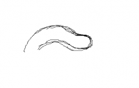
nope, you understood perfectly I was also thinking of that. having the central 'eyes' light up a bit when the armour section pops out. bbdude, you were pretty colose with your first thought of the profile. here is a slightly exaggerated idea of what i was thinking
-
episode n 007 PLEASE CHECK FIRST POST FOR THIS EPISODE phew, distributed 6 already? did anyone watch any yet? no worries if ya haven't.
-
this is kinda what i was thinking for putting mouse over segments.

-
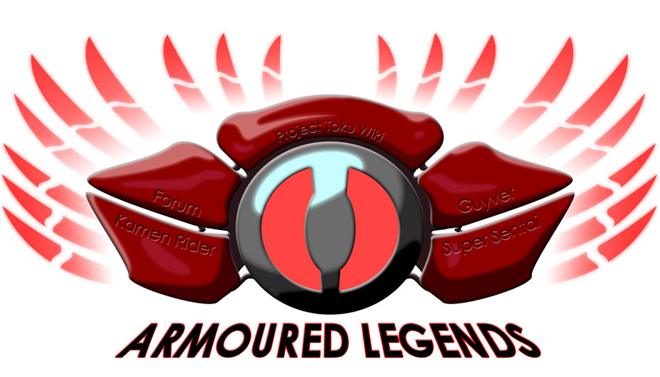
I understand what you mean now BBdude. thanks for doing a mockup for that. I can say quite clearly now that you are absolutely right when you said I may be going for the glossy look. my whole thought process is focused quite clearly on the armour of kamen rider kabuto whilst also considering the shell of a crab and turtle. I can understand that even such a glossy look will have more fuzzy edges on the highlights in places due to the angle of incidence. I'll consider that strongly so this is very useful, thanks. Aether, thanks very much for your feedback. I appreciate the centrality of the text from a layout perspective but I need to point out that with the top 'clam' being 3 dimensional, the part where you placed the text is almost at a 45-90 degree angel from the viewer. I guess I didn't put that across very well so I need to figure out a way to make it clearer. the reason I put the words on the edges was to try and accentuate the edges themselves. sort of... if you think of a steering wheel and the writing that sometimes appears on it... do you understand what I'm getting at? the text is actually black, but i made it subtly transparent, so it looks like the shade of being inset, but i will definitely play around with that to make it more apparent. the central part, it is meant to be lit up. shading it in any way would destroy any hint of being lit so I need to do something about creating a bloom effect over that. is that what you meant by light emanating? I really appreciate all your feedback guys it is really helpful and what's more, makes the designing a far more fun and less lonely process! I can't work on this today because i'm going out, it'll be tomorrow when i can work on some of those things. well, I might be able to do a quick mock-up of something just to get your thoughts....
-
could you elaborate on this please? I don't really understand what you're trying to say. do you mean it might look good if I vary the softness of the edges for the highlights and shadows? I'm not sure about that since the technique I am using for this is shape layers with soft edge style applied to it. you can't vary the width of styles within a layer, I'm not even sure what I would do in order to cheat the effect. oh.. actually I do have an idea... but that is a real pain, I'll wait to confirm what you mean before I go ahead with anything. I'd like your assistance with some kind of mockup if you have a clear idea of what you mean. good observation on the width, actually this is 66% of the original document size. I am not sure about teh way the news would be incorporated with this logo, because of the symmetry, I don't really want this logo to be offset to one side. it needs to be central. what I was thinking of doing is to have the links that are currently horizontal, set as vertical to mirror the news. then have both of them set to hide by default and to become visible on mouse-over. that might result in less people viewing the news panel, so I may just do that for smaller screens and somehow have them set as visible by default for larger screens. though I'd have to investigate the potential of including IF statements in CSS. want to avoid jscript... p.s. I'm hoping you like it as it is anyhow, since every time I look at it I fall in love a little bit. I find it rather sexy, aside from the need for some improvements. can't wait until it gets finished.
-
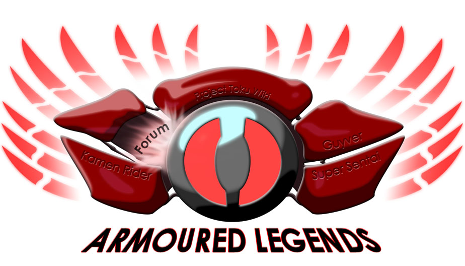
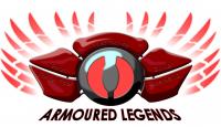
So I decided to go ahead with shading and highlighting on this today. I don't believe I ought to consider this a finished design. Aside from necessary colour adjustments, I think it needs something more, possibly in the way of texture or additional detailing. I'd appreciate any further thoughts you may have
-
a playbook? I didn't know you could actually buy them... mr stinson? oh cool, you got another blackberry? well it is good for your office since you use that messaging thing. it is good that you did not get the iphone because apple is way too overzealous with their security. do you know that i can't even choose my own ringtone? If I want a new one, they force me to actually buy one from their store. I can't choose my own sound file. as soon as I am out of my current contract, I will jailbreak this phone and do the stuff I WANT to do with it.
-
I would suggest sideways.
-
Thanks durendal, I appreciate what you're saying, of course this is a basic concept and would be developed more. like you should be able to see the development that has occurred since my first post up there and my post previous to this one. my intention is to work on the separate panels, adding shading and highlights to give them much needed depth. the central 'disc' is quite flat and dull on our current design, I want to give it a bit more 'life' by giving it a shine and faux reflection like a control metal. The separate panels, are rather ambiguous shapes unless you see them as three dimensional. I will be adding shading to them. the logo I am working on producing will have a more solid feel rather than the flat watercolour style of the current front page logo. sort of a similar fashion to this old guyvernet splash logo http://drag-5.deviantart.com/art/The-Guyver-Net-splash-screen-40711314
-
-
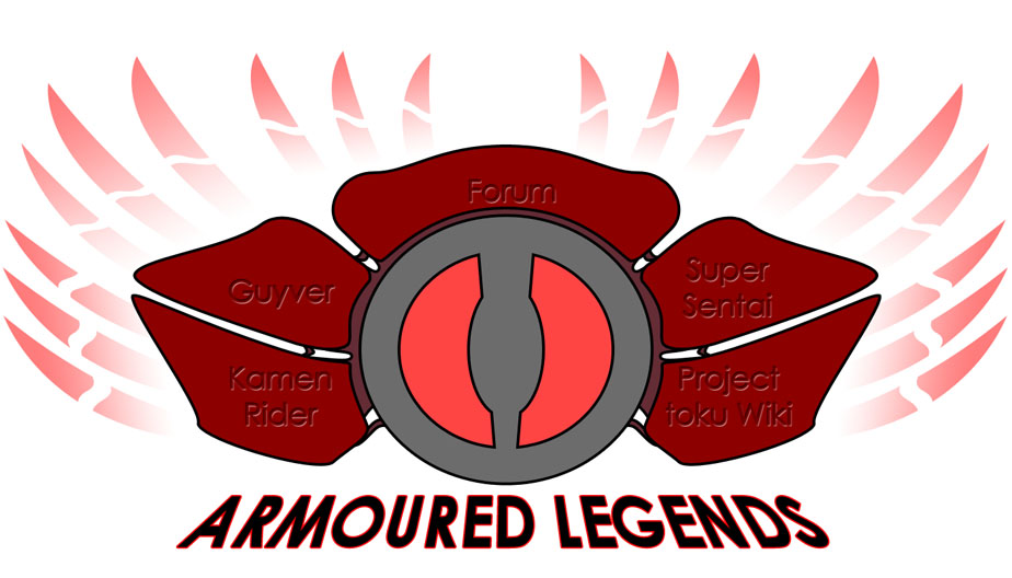
Hey, I decided to work on this design idea today. playing with some themes i thought might be really cool.
-
-
brilliant. thanks guys, your thoughts are really appreciated. I also prefer the second one. it was a result of looking at the first one and just going with my own feelings. it's purely artistic like the current design. I can appreciate how it looks clumpy, i think. I'll have to think about that and ways to work at making it feel a bit more relaxed. also, I understand about the words. I can understand how they might get lost within the commotion if they stay where they are. some ideas i had, the same way as what we have now, I was thinking a two stage image. as the mouse goes over each section, it actually 'opens up' and the words sort of 'shine' out from within. that's pretty ambitious, but if I was able to pull it off, it would turn out pretty damn beautiful.