Jess♥
-
Posts
6,201 -
Joined
-
Days Won
160
Content Type
Profiles
Forums
Articles
Everything posted by Jess♥
-
a playbook? I didn't know you could actually buy them... mr stinson? oh cool, you got another blackberry? well it is good for your office since you use that messaging thing. it is good that you did not get the iphone because apple is way too overzealous with their security. do you know that i can't even choose my own ringtone? If I want a new one, they force me to actually buy one from their store. I can't choose my own sound file. as soon as I am out of my current contract, I will jailbreak this phone and do the stuff I WANT to do with it.
-
I would suggest sideways.
-
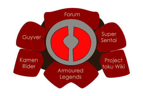
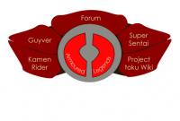
Thanks durendal, I appreciate what you're saying, of course this is a basic concept and would be developed more. like you should be able to see the development that has occurred since my first post up there and my post previous to this one. my intention is to work on the separate panels, adding shading and highlights to give them much needed depth. the central 'disc' is quite flat and dull on our current design, I want to give it a bit more 'life' by giving it a shine and faux reflection like a control metal. The separate panels, are rather ambiguous shapes unless you see them as three dimensional. I will be adding shading to them. the logo I am working on producing will have a more solid feel rather than the flat watercolour style of the current front page logo. sort of a similar fashion to this old guyvernet splash logo http://drag-5.deviantart.com/art/The-Guyver-Net-splash-screen-40711314
-
sorry, I'll sort you out via email, wait for my pm.
-
Hey, I decided to work on this design idea today. playing with some themes i thought might be really cool.
-
eh? did you look at the first post? it's right there. how can you miss it? it takes up the entire screen.
-
brilliant. thanks guys, your thoughts are really appreciated. I also prefer the second one. it was a result of looking at the first one and just going with my own feelings. it's purely artistic like the current design. I can appreciate how it looks clumpy, i think. I'll have to think about that and ways to work at making it feel a bit more relaxed. also, I understand about the words. I can understand how they might get lost within the commotion if they stay where they are. some ideas i had, the same way as what we have now, I was thinking a two stage image. as the mouse goes over each section, it actually 'opens up' and the words sort of 'shine' out from within. that's pretty ambitious, but if I was able to pull it off, it would turn out pretty damn beautiful.
-
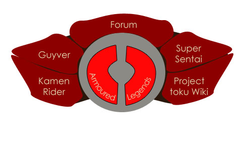
here is a mock-up of my first rough idea of what a new design could be like. or maybe something like this
-
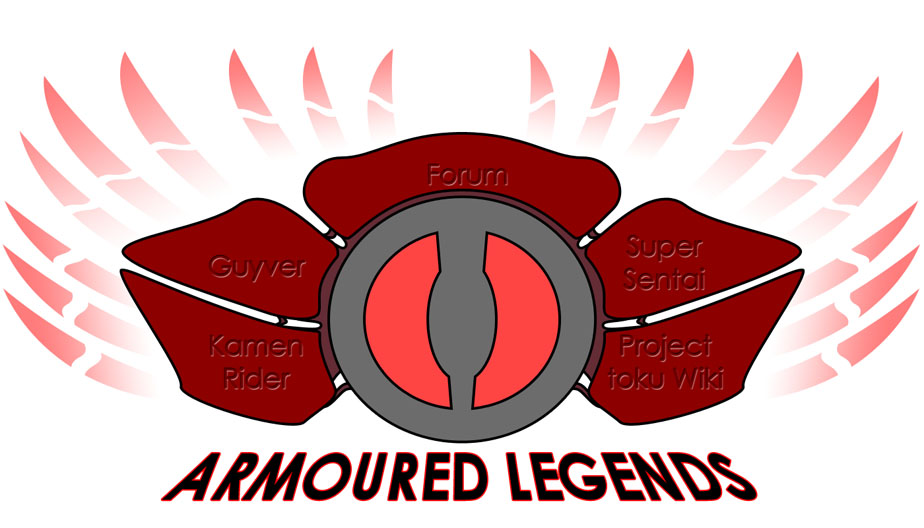
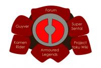
just thinking about the design for our title page. I was looking at it the other day and i thought perhaps it can be changed. I was specifically looking at the style, the sort of artistic painted messy style, and was thinking that perhaps it's time to change it to a more structured mechanical design. The theme is good, I'm happy with the inherent references to wheels, lit up eyes, tentacle monsters, guyver control medal, kamen rider belts etc. it does fit quite well and i am in no way unhappy with it. what I was thinking is that we could have a newer version of that. think about when the guyver is first activated, it is all messy with tendrils everywhere, etc. then when it is formed, it is sleek, tidy, armoured, solid. so I was thinking of taking the current design and re-imagining it into a more symmetrical and more tidy and structured form. it would contain elements that it currently contains, but the configuration would be different. it would also potentially allow the inclusion of the news panel in a less obtrusive way. the news panel currently sits on the side, sometimes getting in the way of the main logo when the screen is reduced in size. there could be some way to integrate that better, but i don't currently have any solid ideas. ideally I am thinking what i might like to move towards if such a change were to go ahead, is something like the following: take the current 'disc' and straighten it up to have the two 'eyes' aligned vertically. have 2 segments on each side, one below and one above. on the segments, we would have separately the current links and the words 'armoured legends'. the segments would probably be red. we could try and mimic the colour scheme of something like gigantic XD and kamen rider kabuto. I'll see if i can make a mock-up of my idea.
-
wow! that is pretty weird! maybe because it's one of the earliest pages to have a good amount of dialogue? looks good! shall I send the whole volume to you? got to piece together the double pages and fix the colour levels etc. it's a shame the translation is not too good. if I had time, I'd re-translate it for you before you put any words down. for example, kurumegnik in that panel, says "what is it" rather than "what do you mean" he's referring to shin's surprised expression in the previous panel.
-
thanks. the scans I have for volume 8 are incredible quality. they are large and very clean. ironically, the scanlations we currently have uploaded for volume 8 are terrible quality. I'd like to see what you can do. I'd also like to do a very good quality for volume 8, perhaps better than what we normally do. perhaps a width of 1000 instead of the normal 800. I'll prepare some pages for you (right size, levels, name, etc. ) and send them to you in a PM.
-
oh I see. as it is a precursor, it is possible that it can tarnish some parts that we have lived with for a long time and that our imaginations have engaged with. such as the origin of the space jockey. I can imagine how the origin of that guy could be a downer in some way. perhaps it would help to not take it as gospel? to take it as the creators own version, but not a definitive version. after all, after all this time, we each own some part of what we have watched. we own our own interpretation..
-
today i have started uploading episode 6. PLEASE CHECK FIRST POST FOR THIS EPISODE
-
yeah those scans are from the japanese, found online, can't remember who found them, it's in a thread around here somewhere. when viz is uploaded, it will replace those nice scans. would have been nice to have those with english but we are desperate atm. I still have them on my computer so if anyone wants to typeset them, I can provide. I actually have good quality scans for volume 2 up to volume 10. want to replace what we have at some point. we don't know who kazuto is. Aether got me those scans. Kazuto is just some cool guy who worked with some other cool people to do volume 4. I'd try contact him and gain his/her permision to host the works but no idea on how to do that. yes, the mcgyver t-shirt was takayas work. it's not been put in by viz. and it seems viz reversed that and the 'bent' on shou's shirt. nicely done, I had never noticed before!
-
aww maaan... that's too bad. but thanks for telling us. I can set my expectations low. so without spoilers, did it just not deliver an interesting enough story? or was it really poor example of ridley scotts work? or was it just not as totally epic as you were hoping?
-
bananaking, you're a VIP, check the VIP section dude
-
a few promotional stills should be ok, but footage would cause copyright issues. it is a good idea for sure and all depends on how much work it is for Odin,.
-
volume 2 - 4 found by Aether vol 2 by viz vol 3 by viz vol 4 scanlated by Kazuto volume 5 scanned by Matt Bellamy vol 5 by viz volume 6 and 7 provided by Del and River Chaos vol 6 by viz (chapter 1 originally scanned by River Chaos) vol 7 by viz
-
no probs. purgstall hasn't posted here in a while, has he been around? let's have a good talk next week I'd rather wait til we're all good.
-
really? I hadn't heard that. I wonder where that was written, it is certainly an interesting hypothesis. thanks durendal
-
do you mean this one?
-
sorry no, we've had a thread about this for a while. called something like 'page format'. if you really want the convenience of downloading it, I made an easier system available to VIP members. it's not available to non VIP because even after we specifically asked people not to post our work to manga hosting sites, somebody still did it. so we really don't want it to be easier for them to do so. we can't stop them completely, but I would rather it be easier for people to read the manga here, than for people to upload it elsewhere. if they want to go against our wishes, make them work for it.
-
31 may 1989. I think we put the publishing date in the wiki. might be wrong. it is quite close to his style isn't it. some pictures are obviously different though. the guyver is a bit more lumpy. also seems to like horizontal shading. something takaya-sensei has never really done.
-
wow, I forgot about this. I've started seeding episode 5 just now! PLEASE CHECK FIRST POST FOR THIS EPISODE
-
interesting, I will be looking forward to how it turns out!