

Jess♥
*Queen
-
Joined
Everything posted by Jess♥
-
ha ha that mega64 is brilliant!! I laughed my socks off when i saw teh one with shigeru miyamoto! but kojima actually joined in!! that was class!!
-
best for self sharpen would be more like a beavers teeth i expect. because they gnaw wood and their teeth are designed to self sharpen for that purpose. able to cut flesh, i would imagine to be redundant since as i said, beavers can gnaw through trees. but anyhow if you want teeth specially adapted to slice through flesh, you could perhaps look at things like pirhana or shark. stabbing teeth, you would want to most likely look at sabre tooth tiger maybe? teeth for stabbing though... not very efficient way of killing. you would need a wide gape of mouth in order to use that effectively, any animal that uses a stab motion, is usually using teh pressure of the bite to throttle the prey or to hang on until the animal tires. I cannot think of any predator that kills be stabbing. nnot with teeth anyway.. ther eis teh stinger of some animals. also a snake with it's venoim. oh i forgot that ,yes thats the only stabbing i can think of.
-
yes rats are a good example. the first thing i thought of was george orwells "1984". here is a link to an excerpt http://www.liferesearchuniversal.com/1984-23.html
-
oh !! hey,. that pun is not that obvious! I just got it! I'll spell it out for others. inui, is taken from inu - dog. ogami is taken from ookami - wolf
-
I saw faiz and i remembered ... kamen rider faiz is teh COOLEST rider there has ever been!! maybe not the best series, but definately the COOLEST. I was almost salivating watching faiz get in gear... but then of course, this is not faiz. not the true faiz. actually the guy was kinda mediocre. for a start he didn't have the same determination in his movement. he was almost the same but just not quite forceful enough. also, the suite seemed to be made out of a different material that gave it an almost soft feel. I noticed this with the blade suit as well. but then.. this is not inui takumi. who were those guys that diend was using? it looked like kamen rider amazon or one of those wierd colourful early ones.
-
yes, that was my initial idea. that's why i originally started playing with my ink, and was doing that writing. the initial concept for this whol thing was to have a haphazard ink style. the best thing i can thik to describe my influences is hideo kojima's artwork.
-
nice find zeo! I really enjoyed that.
-
it was HYBRID RAINBOW for me. although before that.. I still LIKED FLCL.. just that that part where they play HYBRID RAINBOW is what made me love it.
-
>Mei-chan no Shitsuji 08 is available subbed by TimeLesSub >Mei-chan no Shitsuji 09 is available subbed by TimeLesSub
-
In that case here are both modes for your perusal. http://www.japan-legend.com/testpage/index4.htm http://www.japan-legend.com/testpage/index5.htm i also prefer the clean version.
-
ok, I painted over parts of the front ink splotches. is this what you were referring to, or was it more than that? http://www.japan-legend.com/testpage/index4.htm ( you might have to refresh the page)
-
ok, I added a mask to reduce the amount of messy ink and i placed it within a page. http://www.japan-legend.com/testpage/index4.htm if you still prefer the clean version, I will prepare a page with the clean version for people to have a look at.
-
ok guys, what i have done now is that i printed it out faintly and used it to dreate outlines. I experimented a couple of diffrent techniques. i tried using a brush pen, I used a black marker, I tried using my ink and pen. I thik that the original intention when i started on this journey was a pretty erratic ink and pen style, something that loooked really energetic. so when i started using teh ink and pen, I forgot to siphon off the excess from the nib the first time i dipped it in hte ink. it made a big splodge on hte page!! I thought.. oh well nowe i made a mess, but i remembered my original intention so i bent down and blowed on hte page. now a couple minutes later and with a very light head from blowing so much... I had a interesting messy drawing ..!! so i have nhow scanned it in and addd it to hte design. I am unsure which is better. the clean version or this ultra messy version. here is the messy version anyhow.

-
I like the font we have been using. BBdude really made a good choice with that font. i decided to forget about that handwriting style... i just couldn't get it to look special. so i placed the decent font with the image design and played about with colour and texture. I am really liking what i came up with. it's just the edges that needs work. too perfect.
-
ha ha ha, thanks cannibal!! that's brilliant!! can we use that with hte release of volume 26 when it is scanlated?
-
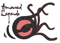
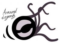
ok well this is what i class as proper art. I do that stuff now and then. the way proper art works is that it comes from a special little place in my head that does the imagining of odd things and doesn't always fully explain to me what it is doing. it is the rare occasion when i don't think about it logically. so when looking at it and guessing what it is, I am as much in hte dark as you are! but the fact of the matter is, this design is heavily influenced by the subject matter of this site. when i look at it, I can imagine a number of things going on. the first thing i thought of was like yourself kenji-chan. the control metal. then after i looked at it more, i pictured it as a wheel leaving smoke and skid marks, reminding me of the wheel mecha thing from go-onger. then I imagined it as a kamen rider style logo on it's side. the two sections look like kamen rider faiz's eyes. also, it can look like a belt buckle in some ways. you could say it looks like a monsters eye.
-
that's interesting! do you like it? by the way, you are wrong. it is not a control metal. i am planning on making this more of an ink and brush style. i am not sure how i'll achieve it, perhaps by printing it out lightly and writing over it... I hope that when i have finished working with this it can be a new front page and the logo is pretty simple in nature so it can be incorporated throughout the site.
-
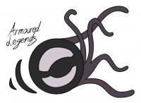
small amendment -
-
some results from a couple of days of inspiration settig in.
-
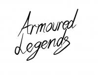
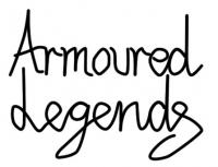
so what do ya think of this ? I did it aligned to a grid, so i had to unwarp the original text to fit a square grid and then i warped it again afterwards, here is teh blocked version.
-
wow, so there are 3 choices. well all of them are around teh same basic principle. I will look at all 3 and refine that.
-
i like your term 'controller units'. sounds interesting. although i think it's more general. boost unit? well your term sounds cool anyhow
-
ha ha ha that's pure genius!! that looks great though!! if the finished version looks similar to that, I would really look forward to working on it!
-
onlive - a good idea.. but entirely dependant on the reliability of the internet and all services involved. put it this way.. if a server goes down in japan or in italy or australia or canada, I can still play halflife 2 without any worries. if my phone line gets interrrupted for whatever reason, I can still play halflife 2. also there is the question of global bandwidth availability. I already heard news a couple of months ago that the internet is going to become too congested in hte future. that technology is not advancing fast enough. this will only add to that great strain. it's a great fundamental idea, but i think it has huge flaws.
-
I would agree with you if diends power was identical to decade. but do you remember something about diend being able to CREATE the riders instead of transforming into them? like doppelgangers or something.?