Bio-Boosted Dude
-
Posts
623 -
Joined
-
Days Won
40
Content Type
Profiles
Forums
Articles
Everything posted by Bio-Boosted Dude
-
can I get feedback on my website please?
Bio-Boosted Dude replied to Jess♥'s topic in General 'whatever'.
You know, i really like that gradiant you have at the bottom of the page. was your intention to have it behind the main box, or is it supposed to be all the way at the bottom like that? it might make it a little less garish than orange on bright blue -
can I get feedback on my website please?
Bio-Boosted Dude replied to Jess♥'s topic in General 'whatever'.
I don't think it's quite as sleek a job as what you've done with this place or taaherbs. i think it largely has to do with the bright colours which feel a little CBeebies. Perhaps its also the over-abundance of century gothic and large text for the main body. these are the things that stick out to me immediately -
hey alkanfel, that strip was quite nice! I liked it. some good choice of alkanphel images
-
Where do you spend most of your time Online and why?
Bio-Boosted Dude replied to Jess♥'s topic in General 'whatever'.
I come here everyday although I don't necessarily post (as i'm sure is obvious). There's another forum i lurk which i used to be an active member but their community just turned to drenn. lots of immaturity, elitism, all that jazz. so i've stopped posting there completely and use the site for news. i probably use facebook more than i should, or at least more than i like to admit. it's a time killer. youtube is almost always open for music or anything i feel like watching at a moment's notice. i spend a lot of time on a certain image board to kill time and for some quick laughs. this also usually delves into me searching something else that i've just seen for more information. Usually I'll find some artwork or a painting or something that I really like and I'll be thrown into google image search and just start looking at art online. good fun when i think about it, the number of websites i browse is very small. -
I imagine that if we were waiting around during its original serialization, we probably wouldn't have expected more than 6 chapters either. We probably would've expected something conclusive, and for something like Sho's death to happen at the end of the 'penultimate' chapter, would probably just re-affirm how short its original intended serialization would be. aint it a good thing that it did carry on though!
-
Your opinion on the Yui Ichikawa thread
Bio-Boosted Dude replied to Jess♥'s topic in General 'whatever'.
I've always found it a very peculiar. I'm astounded that he has managed to post for so long in a single thread. I am also a little curious as to why he DOES only post in that single thread. What attracted him to do this at Japan-Legend in particular. All very peculiar. I don't have a problem with it per se. I can fully understand where Young is coming from when he says he finds it a little creepy. But I'm sure there is no malicious intent and there isn't really any evidence that there will so we may as well leave it as is. I never thought of the 'quotes' in each post in respect to the poll options though. Thinking of them as parodies of anything now, I am quite amused, hehe. anyway as durendal said, he's an active member on the forum. Why cripple our numbers? -
What a shame that this chapter only re-affirmed what we figured out last month, that they're on Silha. I suppose I can be thankful that he only spent a few pages recounting the history of the Advents' first arrival though.
-
I like the colouring of the redhead with the heart tattoo. very clean and suited to the style of the line art.
-
Ah book 8 looks really nice now. Well done GuyverAlpha! Looking forward to the rest
-
his site's been brought up a couple of times, so perhaps he would've mentioned something if he was still around. hmm..
-
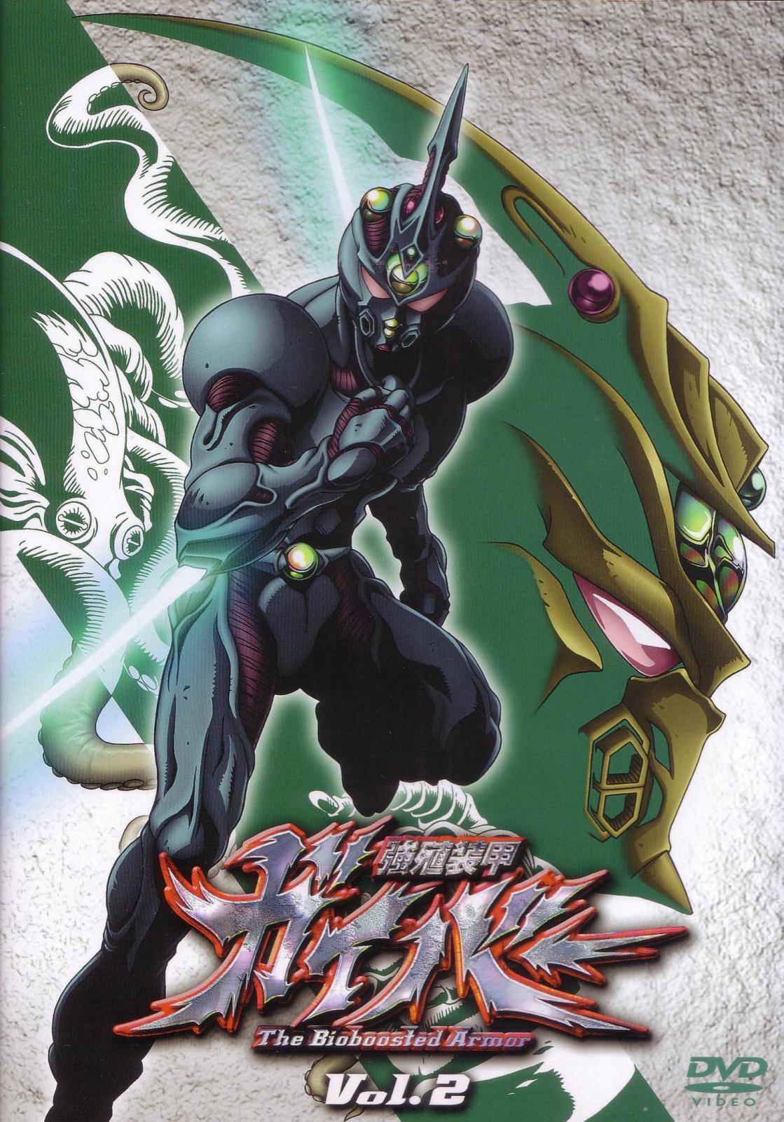
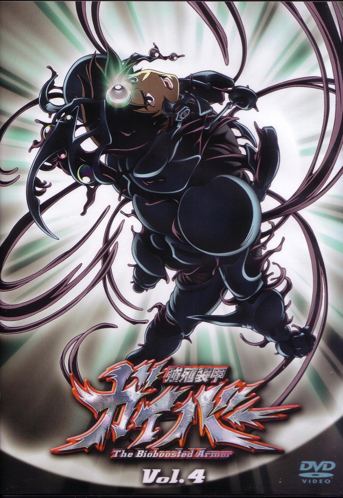
i don't have that dvd cover in particular, but i do have some other high resolution art works

-
good chapter! i liked the narrative quality. felt quite different to what we usually get; in pace and style. i'm not sure if i'm convinced tetsuro and mizuki are on silha though. if they were, i would've thought alkanphel's crystal would've been stolen by now, assuming apollon is not alky (and this is definitely something takaya would show rather than tell) someone remind me, has alky been seen since apollon's awakening?
-
i've seen some pretty impressive papercrafts made with pepakura! it looks like fun and i would really love to see your progress on this.
-
this is beautiful dude! not a single bit of detail that looks off. i especially like the purple bits around his chin and etc. the highlighting is superb. although did you consider putting the landscape lower down on the image at any point? i like how it's done but i think it is fairly high. just a thought
-
i wasn't quoting you about you being "about to offer" the volumes, but about how you said ryuki's arc name had to change. and this prompted me to think whether they really are necessary, or just a bit trivial. sorry if there was misunderstanding anyway...
-
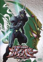
Cannibal!! some of those website are so nostalgic!! i can't believe they still exist. i even forgot about 'guyver.com'. anyone know what that guyver image by the logo is? a custom figure? it's hilarious to see updates from, what, 1998? one of them had a gap of 3 years, the final update in 2001 saying "i don't plan to update this site again ever". pretty funny if not a lil depressing and also thanks for embarrassing me by putting up my crummy freewebs site hahaha. i completely forgot about it!
-
well this is why i thought...
-
does this baka website require each arc to be named? because if so then we have a long discussion ahead of us i'm sure. if so.... i don't think 'guyver' needs to go into every title. using the same arcs as the quoted post: -Origin of the Guyver arc -Struggle at Mt. Minikami -Birth of the Gigantic -Rescue Aptom while 'Exceedingly long night' was a charming pun and reference to volume 25's title, it reads a little engrish i think. although i may just think that because of the engrish already associated with the book and on the volume's cover "Exeed long night"
-
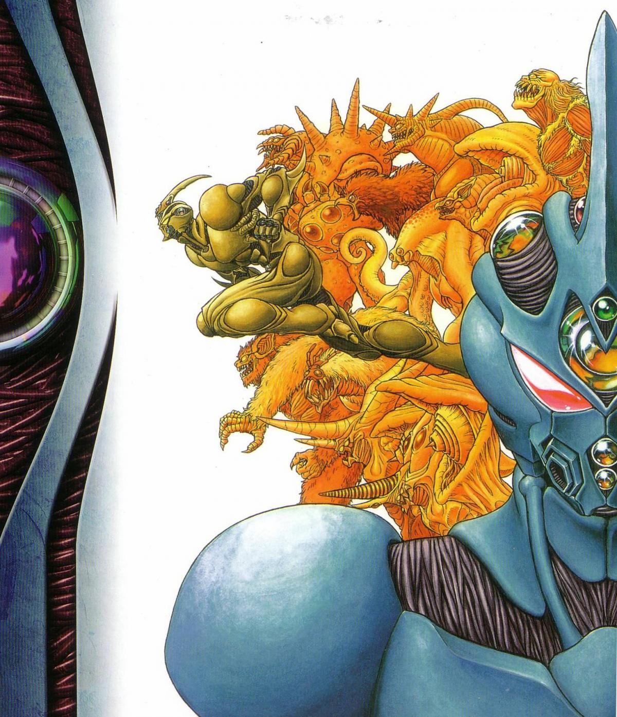
i didn't really think there were any active guyver fansites apart from this one to be honest, so i haven't tried searching in a long time. i really miss bio-boost.co.uk though. great information and images on there
-
i would be tempted to call volume 1 its own arc as well to be honest... it really is a separate struggle to mount minikami.
-
eeeh, 150 minute review of guyver bashing. i watched the beginning and then skipped around a bit on the first part, it doesn't look particularly good so i think i'll pass on the rest. is it normal to review the WHOLE of a series like this? it looked like they were just going to talk me through all 26 episodes pointing out what they liked or didn't. doesn't really seem like a real review format. it's more like 'if you're too lazy to watch the show but eager enough to watch two guys say silly things about select scenes for 150 minutes'.
-
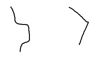
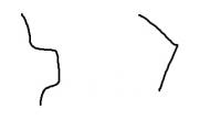
now THAT is nice man. really like it. i'm a little confused about what you meant about the angle of the top panel i attached an image of its profile on the left is how i thought it was shaped. did u mean for it to be shaped like the right? i'm only asking in case i can be of any help in helping you sort out the confusion
-
here's a very crude mock up of what i meant about the shading it's been a while since i loaded up photoshop so this one segment took me quite a while. i don't think i'd have time to do the others i forgot how much effort such things can be!! so well done on what you have so far because it does look good. also my colours aren't as nice yours but you should get the idea!! the panel at the top is what i thought you did - draw in hard shadows and then soften the edges while still keeping some of the hardness basically i'm suggesting having a mixture of softer and harder edges. unless you are specifically going for the glossy look. maybe what i've suggested is too derivative of the 3x3 design i made for the site some years ago.
-
I think a texture could do a lot for it. maybe the kind of smokey look that's on the current one. about the highlighting and shading, . it looks like they're all hard edges with soft ones around at the moment? i think it would look nicer with some variation around the edges. hard and soft and both? also isn't it a little wide with the feathery things? you said a problem with the current design is that parts (links) get obscured by the newsfeed. this design is wider than what we have now. unless you're okay with the design being obscured as long as part of the panel can be clicked on
-
yeah second definitely looks a lot better the first one looks like old style samurai armour. the more organic you can make it look the better; i feel that is what works so well with the current design. it looks a little "clumpy" compared to the looseness of what we have now but i'm really interested to see how you develop the second one. i'll grow to it i'm sure, especially once you spruce it up a bit. also not sure about integrating the armoured-legends into the image like that. might work equally well if not better if it's just a title beneath. just my thoughts!