-
Posts
6,201 -
Joined
-
Days Won
160
Content Type
Profiles
Forums
Articles
Everything posted by Jess♥
-

Rider of 2011-2012: Kamen Rider Fourze (Spoiler/Update Info)
Jess♥ replied to Bobby's topic in Japanese Entertainment
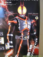
I decided to fiddle with this design so as to 'fix' the lazy design on the bug eyes. I was thinking about how to use the space helmet fascia and somehow incorporate bug eyes into that. a similar thing has been done with ryuki so I thought about space motifs that have a similar setup. i thought of space shuttle widows. so I used that to alter the image a little. here is what i came up with. I'd love to hear your views. -

Rider of 2011-2012: Kamen Rider Fourze (Spoiler/Update Info)
Jess♥ replied to Bobby's topic in Japanese Entertainment
well done bobby, you fixed it. to a certain degree. that first image is so sweet, I think i need to go to the dentist. and those detailed images front back side, show some interesting things. some nicely done details and textures. why do the early promo images always look so awful? I do think this design could have been better though. I mean, it is like they took a space helmet, styled it to look like a rocket then thought ... hm, we need to make this kamen rider style. so they glued two eyes and antenna on the front. the incorporation of those bug eyes and antenna is definitely VERY LAZY design. -

Rider of 2011-2012: Kamen Rider Fourze (Spoiler/Update Info)
Jess♥ replied to Bobby's topic in Japanese Entertainment
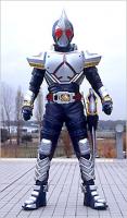
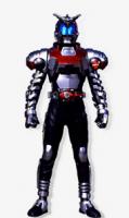
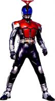
Ok I'm doing it. here is the legacy they have the responsibility of upholding. and here is what they have done. -
I don't know what spring cleaning is. but seeing your surroundings is pretty awesome! your street is interesting. there is no path and your garden has no visible border. around here it is very unusual to see a property with no wall or fence or hedge. and I can't think of any place that has no path by the side of the road. where would people walk? I guess people must walk on the road. it's cool to see your pets. that dog is rather noisy XD
-
I looked at the software site today. it seems it has only had 2 sub-versions since our version. 1.15 -> 1.17 judging by the change log it doesn't seem that the benefits are very substantial.
-
wow. the woes of siblings. I have a brother who is too stupid to know how to use a light switch and doesn't seem to understand what a bin is for, leaves shoes at the bottom of dark stairs and leaves dirty stinky clothes on the indoor line in the kitchen where people prepare food.
-
I just thought about perhaps updating mediawiki since this may give us extra tools like easy syndication of our pages so as to act as advertising. of course, updating software also brings with it a host of issues such as incompatibilities with any custom codes that have been put in. things may get broken and it may possibly cause some issues for our editors. what do you think about this?
-
remember your spoilers please. durendal already answered your question and was careful enough to not spoil it for any one who has not seen the film yet. I honestly don't see the need to be arguing about who has how many claws in their hands, the question was if a particular x-man was in the film and durendal answered it already.
-
ha ha, I disagree. I think the person doing that project needs as much ego uplift as he wishes. he does a great job and i would like to promote it as much as i can as well. nice update. it makes it really clear where you are coming from and how all of our informations up to now are superior. I think i can copy and paste that writing into some places to get some more people visiting and appreciating and even perhaps helping.
-

how do you have your tea?(or other hot beverage)
Jess♥ replied to Jess♥'s topic in General 'whatever'.
the best I could get was bournville cocoa by cadbury. I was actually surprised that it was cadbury that did the best quality pure cocoa. a big corporation like that, I expected them to do the mass produced stuff with additives etc in it. but no, it seems like good stuff. I made a drink with it, very good. I'll see what it is like made with tea. wow, an espresso machine? I wonder how that effects it. tea brews differently to coffee so I wonder how the speed of it effects the flavour. -

What live-action series are you watching or have you watched?
Jess♥ replied to Toku Warrior's topic in Japanese Entertainment
yeah, I remember HK subs were the first opportunity i ever got to see any kamen rider. they were very odd indeed. I definitely wouldn't watch those now. it frustrates me because it lists a QC for the process so that person must have watched through it? well I don't know why that person could not notice such a thing and simply edit the timing. I've done it before so I know how simple it is to do that. now, I'm planning to watch ikemen paradise. the new one will be coming this summer so it'll be good to watch this then that. -

Rider of 2011-2012: Kamen Rider Fourze (Spoiler/Update Info)
Jess♥ replied to Bobby's topic in Japanese Entertainment
even if it is true, which it could be, I think it stinks, it looks like a kids party costume. although saying that, I hated OOO costume from the start. but really.. why must they design costumes that have such a disgraceful reaction from the offset? I mean, what was wrong with designing costumes like kabuto? that earlier drawing was quite nice. I hope that this is what i feel like it is. a joke. and then the actual costume is something that we can look at and admire. -

Rider of 2011-2012: Kamen Rider Fourze (Spoiler/Update Info)
Jess♥ replied to Bobby's topic in Japanese Entertainment
this whole thing stinks. I'm not buying it. it doesn't mesh. I mean, the speed with which this thing has appeared seems fishy to me. with OOO, we had some drawings of possible designs for OOO. and we got info from dukemon who is usually pretty reliable. but it appears none of this info comes from him. also, from what durendal has said about hardly any info on japanese sites... this seems like an incredibly elaborate hoax to me. I've seen cosplay of OOO. there are some pretty good cosplay out there. it's not impossible for some cosplayers and some highly organised group of people to put together something like this. -

Rider of 2011-2012: Kamen Rider Fourze (Spoiler/Update Info)
Jess♥ replied to Bobby's topic in Japanese Entertainment
no. This is a practical joke. if it's not a practical joke, it's an insult. -
wow, very nice johnleprekan! that is pretty awesome and especially in such a short time ! this is exactly the sort of thing I was thinking about. if we all have fun doing this kind of thing, we will have some really nice imagery. my hope is that people will enjoy these banners and they may choose their favourite and choose to use it in their signature on this site or other sites. what i really like about this is how you have really gone to the core of my initial design process. you've identified the key elements and stripped away the more 'kamen rider' type elements and made it more guyver flavoured. bbdude, I'll get you that image now.
-
not forum headers, i was thinking banners for putting in signatures. I have no ideas right now for fonts or sizes or images etc. I was thinking we could try throwing some ideas around. durendal, yeah you know as well as i do about competitions. we are well aware of how those turned out. I'm not looking for that type of thing. even if i only get a few comments from you guys and make a few banners myself, I'll be happy. btw the legend header banner is 600x89 you want some files for that logo? I can give the words and the logo in its various forms. on an angle, straight ahead and dirty and clean. I have psd files for it i can sort those out tomorrow. rotating banners might be cool. if we end up producing something for that it would be very cool. I'll post a couple jpg images.
-

Rider of 2011-2012: Kamen Rider Fourze (Spoiler/Update Info)
Jess♥ replied to Bobby's topic in Japanese Entertainment
that's a nice image. i think that looks pretty good actually. if this is the real deal, that deviant art image help to make the design more palatable. i#'ll write more but i'm really tired atm -
maybe league tables? I don't know about specifics. I think any reasonable banner size would be.... reasonable.
-
heya all, I'm thinking about doing some banners or getting some made. how about a group effort or some kind of game to make as many as we can,. or a collaborative work or something. what do you think about making a banner or many banners that we can use on any other sites we may visit?
-

Rider of 2011-2012: Kamen Rider Fourze (Spoiler/Update Info)
Jess♥ replied to Bobby's topic in Japanese Entertainment
i got no doubts about the name. actually, looking at it, I'm thinking that there may be a possibility of a shred of truth to this images. I still think it seems a bit fishy but I would have to say it is possible. unfortunately. I just think that helmet design looks ridiculous and that logo does look a bit too similar to the den-o logo. -

What live-action series are you watching or have you watched?
Jess♥ replied to Toku Warrior's topic in Japanese Entertainment
hotaru is easily available. durendal, I agree that watching more makes it easier to watch without reading. I do often look away when naruto is on, peeling an orange or something, and they say something and i understand it completely. the problem with this instance is that the subtitles is embellished. I hate sub groups like that. if the character says 2 or 3 words, that does not yield a 10 word sentence. and the 3 words are words that i don't yet know. and the sentence is only displaye4d as long as the character speaks. even speed reading, i cannot capture that sentence. (take a snapshot of the sentence and pick out the key points) I can't abide this type of thing because it's the specific thing I have troubles with. pieces of writing not being let on long enough, I have trouble with at the best of times as my reading is relatively slower to others due to dyslexia. it makes me very angry because it is so fast that I don't even have a prayer. I can understand if it was a normal speed for normal people, I can judge whether or not it is, and i will try and be forgiving of that since i can't expect them to tailor it to my slow reading at the expense of everyone else. but this was blatantly bad and it highlights a trend for that group and i can't be dealing with the stress of getting up , rewinding and pausing the program each time the timer has been sloppy. it ruins the entertainment. that's why i never watched azumanga daioh. but i could probably find another group for that actually. I don't think another group has done hotaru. maybe i'll just watch it without subs some day. edit: just to emphasise, the last time i had this issue was with azumanga daioh, over a year ago. most groups do a good job of timing. -
he he, well whatever gets the job done I don't have the patience for that kind of work recently.
-

Rider of 2011-2012: Kamen Rider Fourze (Spoiler/Update Info)
Jess♥ replied to Bobby's topic in Japanese Entertainment
oh yes, right you are. I was sure it said masked. but i looked again and you are correct of course. -

Rider of 2011-2012: Kamen Rider Fourze (Spoiler/Update Info)
Jess♥ replied to Bobby's topic in Japanese Entertainment
it's a joke. notice how that logo looks like a shopped den-o logo? also, the current trend for logo's is to display "kamen Rider" not "masked Rider". this is a well put together hoax.


