Jess♥
-
Posts
6,201 -
Joined
-
Days Won
160
Content Type
Profiles
Forums
Articles
Everything posted by Jess♥
-
it looks well balanced. good work dude.
-
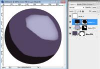
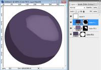
uhm, they're not mutually exclusive. let's see if i can figure this out. i think maybe you mean path based mask as opposed to pixel based? well a path is a vector controlled boundary. it uses maths to create a perfect curve or corner. no matter how big or small you go, the path itself will be perfectly smooth. but the disadvantage is that it is a definite boundary. it has no width so you can't produce a soft edge. well not automatically, you would have to render it out in pixels. also, paths are a bit more fiddly. with pixels, you can just paint with a brush. with a path you have to precisely lay it down. the example image above is painted with a brush except for the actual circle itself. you can see transparency and soft edges on it. that would be rather laborious to get the same effect with paths.
-
the coolest tv advert i have seen in a long time.
-
ah ok, well i'm still not sure exactly how you've done it but good luck with it anyway p.s. technically, using a path for defining an outline or a selection is using a mask. that's what masking is. protecting a specific area so that you don't paint over it.
-
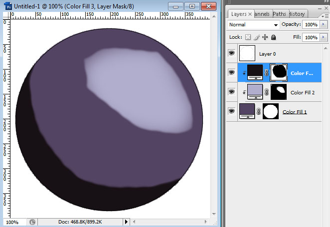
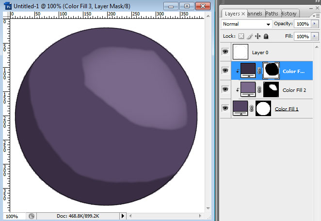
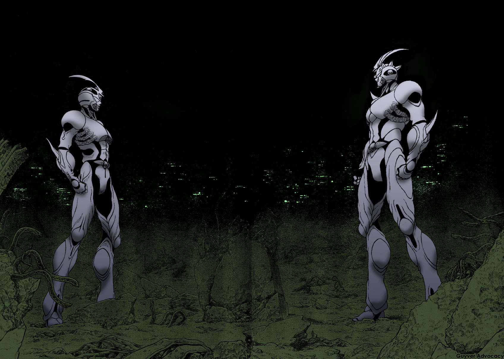
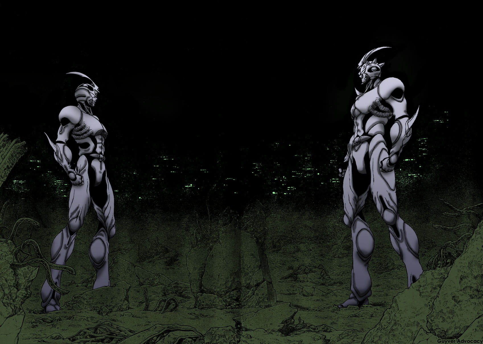
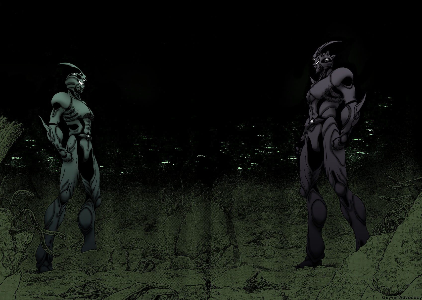
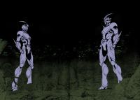
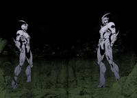
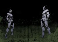
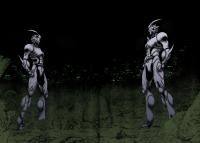
what? ha ha, to be honest dude, i think you're over complicating it with that. just do what works. I don't even know what exact technique you used to do this work you see. when i was playing with it, I actually just used a colour replace. but you can do anything. if you've used solid colour layers with a mask, then all you really need to do is select the layer with guyver 3's highlight and double click the colour and change that colour until it looks right. edit: I made 2 image screenshots just to show you what i mean.
-
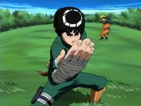
here you go mate. btw, your katakana is incorrect on that first image. you want rokku rii, but yours says rokku rie. if your computer has asian fonts installed, you can copy this - ロック リー
-
that is the most awesome creature i ever saw!!!!
-
ah ok. do you know what region she is from? i would have guessed more to the north because of her complexion.
-
good work dude, it's looking really nice. but please don't post it that size, hardly anyone has a monitor that big ad i had to save it to my desktop to view it. the shading is really bringing it to life and is nice and consistent. the thing about guyver 3, is you have shaded him as a clay texture rather than a leathery texture. give it some gloss by increasing the lightness of his highlight. that should help with the issue you're having.
-
she looks either chinese or korean. my money is on korean.
-
want to share this. you probably heard it already, i think it's pretty popular. but i had ignored it until somebody passed on this video. note, this is the un-doctored version. i think that is what made the difference for me. hearing "forget you" just doesn't seem to have the same impact. THERE IS PROFANITY. (obviously by the title)
-
it seemed too much to be a coincidence. i just felt like i was watching naruto. but it's not a bad thing. now i've ascertained how much is 'borrowed' in anime as a general rule, I've moved past it and will approach it more like eether. i mean... look at that face. now i never figured out why they draw those kind of whiskers on naruto's face. but when i saw this guy, it made sense.
-
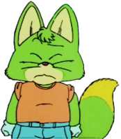
oh wow! and i just found the inspiration for naruto!! a fox guy with yellow ears and a tendency to say datteba now and then. well sure, naruto tends to just use -tteba and usually adds -yo to the end as well, but it's essentially the same thing. and of course the orange t-shirt. i was looking at him and it was just like looking at a wierd naruto. awesome.
-
i come across another great source of ispiration for naruto. a monster named inoshikachou. it took me a moment to cotton on to what hah happened with the name. i ws looking at it, and i saw ino, shika and chou. ino a wild boar, shika a deer and chou a buttefly. then i thought.. DAMN!! this is a trio of team mates in naruto!! ino, shikamaru and chouji! and i actually remember them being called the inoshikachou team at one point! very cool.
-
nah, I'm just a natural when it comes to programs. well when they're coded well at least. i taught the tutors in college how to use the programs. shading layers? they're yours. layers that you use to shade. just normal layers. you can either choose your specific shades manually or you can use black and play with the opacity. but beware when you choose black... if it's night time, cool. but if it's a well lit scene then black will just make it look dirty. in a well lit scene, you would need to take into account the ambience. hmm, I ought to link my lighting tutorial for you. I think i posted it a long time ago on here or on the old guyverboard.. but it's easier to find on DA. http://drag-5.deviantart.com/art/Lighting-Tutorial-82388860
-
thanks salkafar you can use a variety of techniques to get the end result you want. as I've been using photoshop for over 12 years, I may not always use the expected methods. i always swap and change techniques depending on my mood. lately, I have preferred to use solid colour layer to add colour and control it with a mask. I also use clipping mask to make shading more straight forward. if you look at the solid colours image. the solid light blue colour for the guyvers controls all the shading layers. each shading layer has a clipping mask which refers to the light blue layer. so the layer on top of that, i just whacked a gradient on it. dark at the bottom light at the top. layer on top of that, soft brush large. layer on top of that soft brush small. the tone thing afterwards was just a flat colour on top of the other layers and set to multiply. and of course i painted in the detail for the eyes and spheres by hand. (i have to say the most time consuming part of this image was cleaning away the screentone from guyver 3's body. )
-
i did this mainly for bananaking but anyone else can benefit. cleaned solid colours basic light distribution rough shade detail shade tones
-
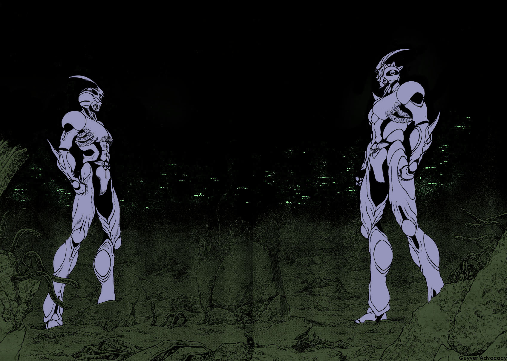
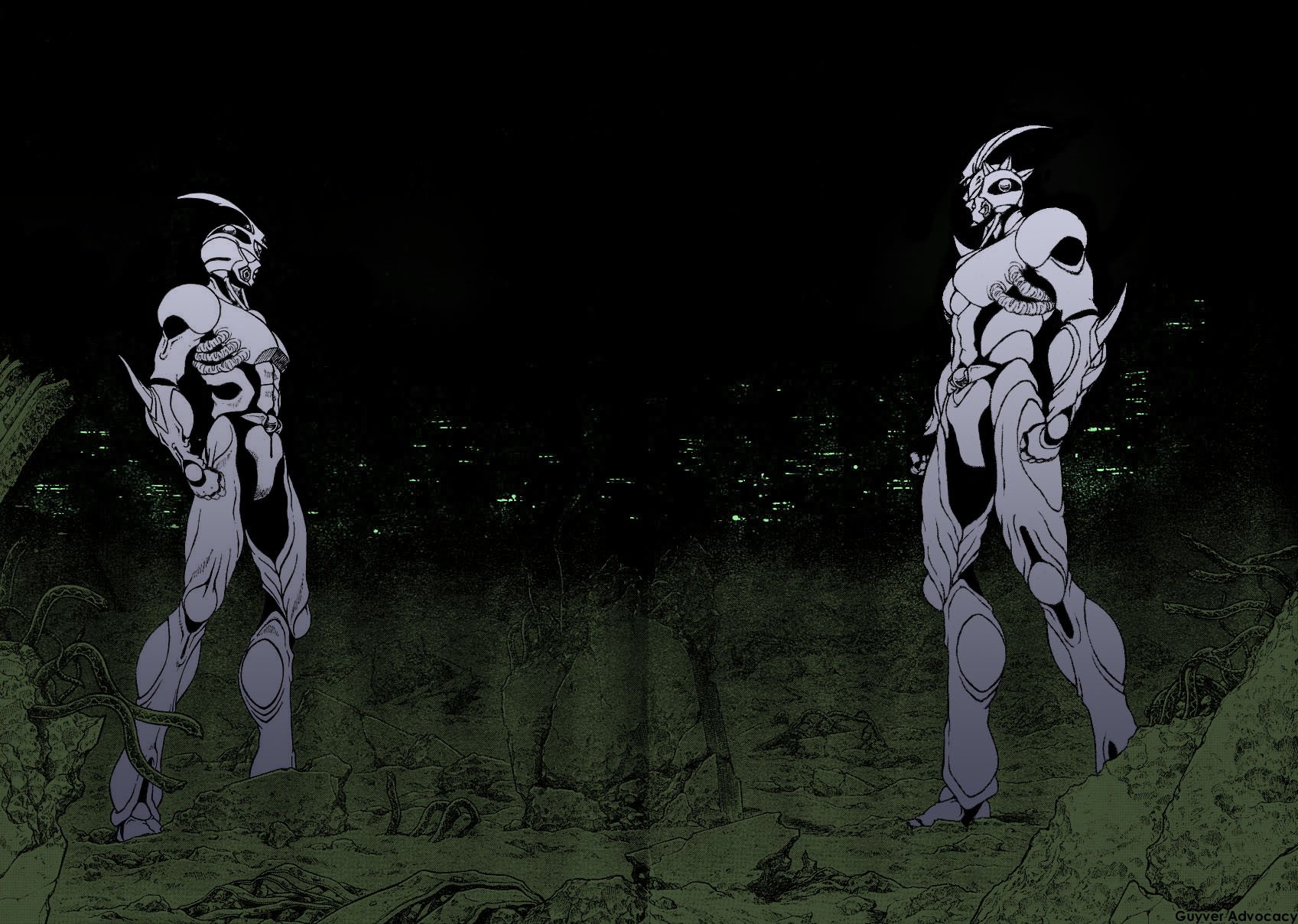
using a tablet, i wouldn't advise it. the edges will be pretty wobbly unless you have a really steady hand. either that, or start working with the path tools. the inconsistency i mentioned. well looking at the purple area, the light appears to come from the upper left, on the shiny orbs and the eyes, the light appears to come from the upper right.
-
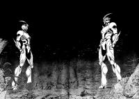
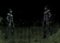
it's got a good general feel, but i have to say is inconsistent. think about what you learned when doing your CGI and apply the lighting you learned to what you see in this image. something i do sometimes, I give you as a tip, i work at different 'levels'. i have a big general shade. large areas of light and shadow. no detail, just a big 'fuzzy' shadow to give the figure it's 'presence'. then i give a medium shade, to differentiate the different parts of the figure and to flesh it out. then i do a surface detail shade to give it that sharpness and detail. I was thinking about colouring an image from chapter 177, if you'd like i can make a thread and show work in progress for it. that is if i go through with it.
-
ah ok, no biggie then full tonal detail... not sure what that means... but anyway this is cool. if the whole point of the brief is to simply get used to using the different features of photoshop then you're doing stellar. perhaps i could challenge you a bit. make the image look like they are in a room with a red light.
-
woah, why so aggressive? i only want to know what your brief is. you can't do a piece of work if your tutor hasn't given you a brief. otherwise, how are you supposed to fulfil the parameters? forget i asked.
-
isn't that cheating? or maybe not. until i know your brief i can't judge. http://en.wikipedia.org/wiki/Creative_brief
-
i think i have said something like that in the past, but i was referring specifically to physical strength. I believe that the zoalord is increasing physical strength equal to what a guyver does because the technology can only make muscles of that strength. that was the logic behind it.
-
nice colour balance dude. so many times, i see people use bright strong colours. you kept it to a nice balance and still kept it bold. what is your brief?
-
oh, i see it now! i thought the black part was a shadow. it's your shirt. and the cat is clear to me now. that is so cute