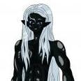
March 10, 20233 yr After finishing up redrawing Kinetic Warrior, I decided it was time to redraw Warrior Wizard, but unlike with Kinetic Warrior I don't have a trace of Joe's original character design for Warrior Wizard ( I do with Gigantic Warrior Wizard, just not Base Warrior Wizard). So I decided to take one of my old Warrior Wizard drawing to use as a reference, because they were fairly close to Joe's original drawing. I ended up deciding on using this one as the base. So I start on it for a while and I start realizing it isn't looking very, WW's face looks like a bloated mess. I'm like I need to stop working on this, it isn't looking good, so I stopped as this is what it looked like So I took a bit to think and I realized I need to break out the official Takaya Guyver one art and use that. So I was basically tracing a rough line art using Guyver one (which Warrior Wizard already shared a lot of basic design with anyways) adding the bits that make WW different from other guyver. I come to some conclusions about Joe's design, one I hate the "warrior wizard type" face mask that Plant Wizard and Warrior wizard has It just doesn't fit in the space on a guyver's head properly and it just doesn't feel natural to draw it. I had to make it really small compared to every other time I drawed it, just to make it fit with the breathing vents (which I have never been good at drawing to begin with). All those blades on the knee, calf, heel just feels like "white noise" being their just to try and make it look cool, but not really doing much and is kind of not really something they could probable make use of in combat for the most part. So I got a rough line art done, one without the cloak and with the cloak . After that I decided I need to get some, at least, Flat Color. This way warrior wizard actually has a color scheme that I can use So this is what I come up with. Here is without the cloak and with the cloak . So that is my attempt, A part of me kind of feels bad for having to resort to direct tracing just to make it all work. I think it just shows how bad I am at drawing guyvers on my own. Maybe there is a way to make Warrior Wizard design less busy and better, I don't known though. So what do you guys think.
March 12, 20233 yr Those links do not really look very trustworthy. can you post your images in a different way please? Otherwise I won't be viewing them.
March 13, 20233 yr On 3/10/2023 at 11:40 AM, Ultimate W'kar said: So that is my attempt, A part of me kind of feels bad for having to resort to direct tracing just to make it all work. I think it just shows how bad I am at drawing guyvers on my own. Maybe there is a way to make Warrior Wizard design less busy and better, I don't known though. So what do you guys think. You should really be sketching out the basic body form and adding worrying about line art later. There are a million tutorials out there, but as long as you practice, you will find your own way of doing things. I can't stress this enough. I also remember pointing out the small tutorials from one of our old friends fan site in another topic, which does not look like you are using. Honestly, I really think you are trying to rush drawing... And you really can't. If you are trying to get a concept down, being a little lazy and tracing isn't neccisarily "bad", but per your title of "Getting back into drawing", it sounds like you want to DRAW and not TRACE. And in this case, your first images are still better, in my eyes, than the traced image. Drawing what you envision isn't easy, and if you're not understanding the fundamentals of drawing humanoid characters, you might as well be jumping into a lake without knowing how to swim. Yeah, you may get something that might somewhat resemble what you want... Or you will just drown and give up. So I will say this. I am very willing to help... But if you are not willing to put the effort in, there will be nothing I can help you with. On top of all of that... Part of things to worry about as well, considering you are using Guyver as a medium, is also learning about the Guyver, and how the armor works. For example, even on the traced image, currently, I have no idea what the sonic orbs on the face are doing in any of your images. They are just floating in the middle of a blank mass ( and in color, just a bright orange mass. Go look at the official Guyvers. On every Guyver but Guyver 1, there is armor plates being bent around them, with clear distinctions that show off some design... And even on Guyver 1, the armor around them is still distinct from the orbs, and you can see the bio material they are connected to. This one part is throwing off the design entirely for me, as I can't understand what is going on there, because it is not Guyver like at all. The amps on the arms, leg and calves are kind of weird-ish and could use fleshing out, but I've seen something like those before, so I can kind of guess what they are meant to be.
March 13, 20233 yr Author 10 hours ago, Matt Bellamy said: You should really be sketching out the basic body form and adding worrying about line art later. There are a million tutorials out there, but as long as you practice, you will find your own way of doing things. I can't stress this enough. I also remember pointing out the small tutorials from one of our old friends fan site in another topic, which does not look like you are using. Honestly, I really think you are trying to rush drawing... And you really can't. If you are trying to get a concept down, being a little lazy and tracing isn't neccisarily "bad", but per your title of "Getting back into drawing", it sounds like you want to DRAW and not TRACE. And in this case, your first images are still better, in my eyes, than the traced image. Drawing what you envision isn't easy, and if you're not understanding the fundamentals of drawing humanoid characters, you might as well be jumping into a lake without knowing how to swim. Yeah, you may get something that might somewhat resemble what you want... Or you will just drown and give up. So I will say this. I am very willing to help... But if you are not willing to put the effort in, there will be nothing I can help you with. On top of all of that... Part of things to worry about as well, considering you are using Guyver as a medium, is also learning about the Guyver, and how the armor works. For example, even on the traced image, currently, I have no idea what the sonic orbs on the face are doing in any of your images. They are just floating in the middle of a blank mass ( and in color, just a bright orange mass. Go look at the official Guyvers. On every Guyver but Guyver 1, there is armor plates being bent around them, with clear distinctions that show off some design... And even on Guyver 1, the armor around them is still distinct from the orbs, and you can see the bio material they are connected to. This one part is throwing off the design entirely for me, as I can't understand what is going on there, because it is not Guyver like at all. The amps on the arms, leg and calves are kind of weird-ish and could use fleshing out, but I've seen something like those before, so I can kind of guess what they are meant to be. Yeah, I think you hitting at the parts that I've been struggling with really directly, which what I was trying to figure out, but honestly couldn't. I think this is exactly why I have been struggle and probable why the heads haven't ever looked good to me when I draw them. Being use to drawing humans with a anime style probable isn't helping much as that style encourage a more... I wanna say less detailed focus, which the opposite of how Takaya draws guyvers and Zoanoids as every curve of the body drastically alters how the lines of his character are drawn. I understand it, but I clearly have a problem applying it. One of the reasons I stop working on the Ultimate w'kar picture after I had used the tutorial and position reference you provided to redraw the guidelines reworking the whole head basic shape, before making a new rough line design, was that once I had got the basic jist of the head, I was drawing the neck and top part of the torso and just immediately realize something was wrong. The head look bigger comparatively to the body through granted the position of the head and the body would have cause a prospective skew anyways, but not so much kind of have that kind of a distorted look and even when look at the head itself there was still something about it that didn't feel like it was a part of the body and I think you right. My fundamentals are not entirely correct and because when you draw something with bad fundamental the resulting image will always be off. I've been draw by creating guidelines for the shapes of the head and body for years now, but they are fairly simplistic, which while works perfectly fine for anime style humans doesn't work well for something that relies on the artist being able to clearly see the shape of the curves that make the body in a 3 dimension space (which is how Takaya style seems to work, which is why the shadows he draws for fabrics or some times on guyver 3 have a lot more lines to show the curves of the fabric as is it is deforming to fit its wearer's body which is honestly a lot different from a lot of manga out there I've read, yes, they still use them, but not in the amount or to the same effect as Takaya) and I think fundamental this one of the fundamentals that is causing at least some of the problems, but clearly it is not the only fundamental I've been struggling. I'll just have to take this to and practice my guidelines in a way that makes use of this information.
March 20, 20233 yr On 3/13/2023 at 4:08 PM, Ultimate W'kar said: Yeah, I think you hitting at the parts that I've been struggling with really directly, which what I was trying to figure out, but honestly couldn't. I think this is exactly why I have been struggle and probable why the heads haven't ever looked good to me when I draw them. Being use to drawing humans with a anime style probable isn't helping much as that style encourage a more... I wanna say less detailed focus, which the opposite of how Takaya draws guyvers and Zoanoids as every curve of the body drastically alters how the lines of his character are drawn. I understand it, but I clearly have a problem applying it. One of the reasons I stop working on the Ultimate w'kar picture after I had used the tutorial and position reference you provided to redraw the guidelines reworking the whole head basic shape, before making a new rough line design, was that once I had got the basic jist of the head, I was drawing the neck and top part of the torso and just immediately realize something was wrong. The head look bigger comparatively to the body through granted the position of the head and the body would have cause a prospective skew anyways, but not so much kind of have that kind of a distorted look and even when look at the head itself there was still something about it that didn't feel like it was a part of the body and I think you right. My fundamentals are not entirely correct and because when you draw something with bad fundamental the resulting image will always be off. I've been draw by creating guidelines for the shapes of the head and body for years now, but they are fairly simplistic, which while works perfectly fine for anime style humans doesn't work well for something that relies on the artist being able to clearly see the shape of the curves that make the body in a 3 dimension space (which is how Takaya style seems to work, which is why the shadows he draws for fabrics or some times on guyver 3 have a lot more lines to show the curves of the fabric as is it is deforming to fit its wearer's body which is honestly a lot different from a lot of manga out there I've read, yes, they still use them, but not in the amount or to the same effect as Takaya) and I think fundamental this one of the fundamentals that is causing at least some of the problems, but clearly it is not the only fundamental I've been struggling. I'll just have to take this to and practice my guidelines in a way that makes use of this information. FYI I edtied your first post to embed the pictures to the site, no need for links any more. We all love Takaya's work, but don't become too obsessed with matching his artwork line for line. You end up getting more focused on that than you do your character and it hurts the end result. Like Matt said, take risks and go with it. In the end what is the focus you want for your character should come first, then design and play with the look after. The cool thing about art on a PC is the ability to change and layer items. Where I grew the most with my ability to change and draw on the PC was when I stopped using Guyver art work and modifying it (my first WG picture is litrally that it's a combo of offical work modifed and recoloured) to where I was about to take a Street Fighter image and then draw Guyver armour over it to make the characters I wanted. It gives you a far greater range then to draw things at different angles. This is the same advise I give people painting minuatues for the first time, don't look at art as a failure if you do something you don't like, everything including failure is helping you towards learning a method to a style you'll like doing. You can always reset or redo a step for different results. (Though for mini painting, that involves terps or met spirts to clean the paint of a mini! Not deleting and adding a new layer) Developing that is probably the most important step you'll ever do. Get yourself Adobe Potoshop or Manga Studio and just play with it and have fun. You'll be in a far better place than I was 20 years ago with Unlead iPhoto and 1 layer for everything I did!..... And btw, I liked your first pic in the post more than the later pics, don't be scared in taking that as your starting point and editing in the PC later. There's all sorts of tools to take images and correct the size and parts later.
Join the conversation
You can post now and register later. If you have an account, sign in now to post with your account.