odin
Member++
-
Joined
-
Last visited
Everything posted by odin
-
the forum does not animate gifs when you attach them, what you uploaded just appears as a single frame, I would suggest using photobucket or another image hosting site when showing animations ryuki. Edit: ok, never mind, you did just that It looks great, I will test it now.
-
I'm glad you like it, I think I'll take a break today from spriting but I will leave you guys with the official color art of guyver 3 to compare with the one I did first. Edit: can we start discussing how what kind of story we will give to the game? should we use the original story and abridge it or make our own story? I do have in mind to put what if scenarios as secret chapters for example one where Alky has a Guyver Unit. Any ideas or suggestions are welcomed.
-
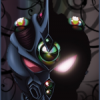
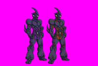
ok, minor update, I changed the size of Guyver 3 as to make him a bit more in scale with Guyver 1, thanks to Guyver0 for pointing out since it was bothering me as well, now on to Aptom and Neo ZX-Tole. Edit: Guys I just managed to get permission from an artist from deviantart called Aiuke to use his design on Bioboosted Alky, so I will definitely make him a secret boss in the game. here is how he looks: http://aiuke.deviantart.com/art/Doodle-2-guyver-AU-354445576 and here is Lucithea's full body version: http://lucithea.deviantart.com/art/2GAU-Guyver-Zoalord-Archanfel-355666445 cool huh?

-
Game maker can hold animated gif (it can have transparent images or you can just give it a magneta background and it will automatically turn it transparent, I suggest you do that) as well as movies, although I would recommend using .mov format since the codecs that it supports are mostly the ones that windows media player has by default so I would recommend using a gif instead. As for the construction of the Menu screen it can have layers since I have done it before with my original game I would just need the control medal shine animation separate to place it in between the unit and the fonts.
-
Here is a prototype version of the games menu screen, not finished yet since I want to add a bit more stuff, to it, i was thinking of maybe giving the control medal's glow a an animation (think you could do it ryuki?) and having the our heroes fade in and out in the background. Thoughts and opinions? what kind of music do you guys think would fit in it? I was thinking using one of the track from the Guyver Image Album, specially this one track 02 Kyoushoku Soukou Guyver - Main Theme http://www.youtube.com/watch?v=0M6FPhlgr-U&feature=youtu.be
-
yes, this is awesome indeed, it does not need anything else, thanks a lot for this Ryuki, do you think you can send me the psd file (if you are using photoshop that is) so when I start mounting the game I can fit it in the menu screen?
-
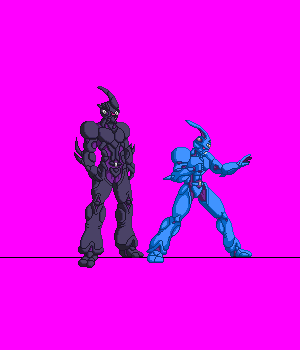
yes he is taller, it is just that I did not have enough space on the paper to make him size accurate and I was too lazy to take out another piece of paper but it does not matter cause when i transfer it to sprite form his size will be series accurate and according to the wiki he is about 10 feet tall so he must be bigger than aptom and as big as Guyot. I really can't decide on the color for the internal part of Guyver 3's armor so I will just make different versions and you guys can decide which one looks best.
-
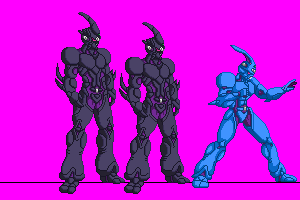
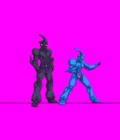
Update time, here is an updated sprite of Guyver 3 side by side with Guyver 1 for size comparison, I will return later with Aptom and Neo Zx-Tole. Edit: also, do Guyver 3's colors look good or should I change them? I was thinking maybe changing the color of the inside of the armor brown, what do you think?
-
Ok Guys, here is something for you guys that I have done so far, I was supposed to do more stuff for guyver 1 but I umm...got side tracked making the standing sprites for Guyver 3, Aptom and Neo Zx-Tole (is that how it is written? there are so many versions of his name that I get confused) do their stances look appropriate or should I teak them before I move to spriting them? also is the size of the megasmasher beam big enough and can somebody whip up a size chart for the characters in the guyver series it is so I can make them size accurate, I know that Aptom is the tallest of the heroes but I'm not sure how tall is Neo Zx-Tole, thanks in advanced.
-
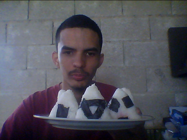
Here is something different, I got bored of doing regular dishes from my country (I love to cook) and I decided to try Japanese dishes, first up is the onigiri, I used sushi rice to make it and gave it a cherry filling and wrap it with Nori (a type of sea weed) not bad for my first attempt but the rice had no taste, I was told that the sushi/ oriental rice is sweet but apparently the one i have it is not so next time I will use my method of cooking rice and put some salt in it to give it some flavor. any suggestions for flavor on the rice are welcomed.

-
yeah, I was thinking that it could use a bit of texture, try it out to see how it looks. just on the word Guvyver and maybe on the G unit.
-
Dude that is awesome, I don't think it needs any changes at the moment so go ahead and continue working on it. This motivates me so much, later today I will upload what i have done so stay tuned people.
-
yea the left side of the V could use a little adjusting, it does not look aligned well with the Y, the E looks good to me, don't know what you want to fix on it. It is pretty late were I live so I will continue discussing this tomorrow if you have any more questions.
-
Niiiiice, I really dig it, i would suggest the inner blue to be a bit darker and maybe a metallic gradient, other than that it looks awesome.
-
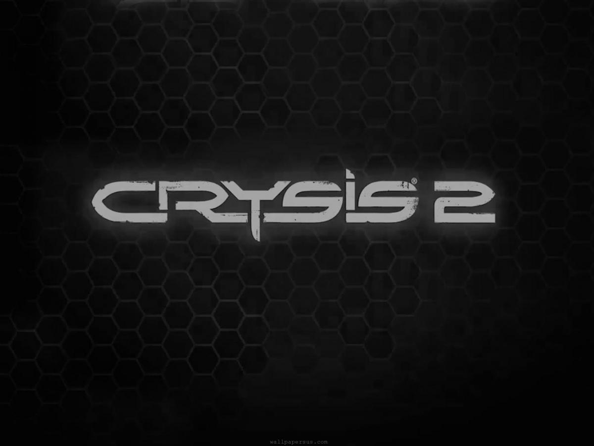
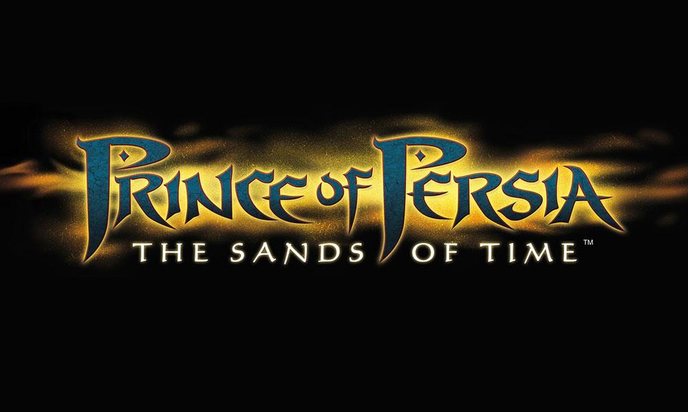
yes of course, I have no problem with that, here is something I thought of from the top of my head, the words "The Guyver" could be in style similar to the Crysis game logo with maybe a guyver unit in the background and a blue glow similar to the prince of persia 1 logo, dunno about the color of the font tho, the word "Rebirth" should be a bit smaller in white font below "The Guyver" word. Here are the logos for you to use as reference.


-
I'm surprised nobody has made this thread yet, the game is coming soon in April but there are lots of things that can be discussed such as the prequel of the main story so far which can be read through the comics that had been published recently as well as the roster, do you want to see a particular character in the game? here is the roster so far: Superman Batman Wonderwoman Flash (Barry Allen) Aquaman Green Arrow Cyborg Hawkgirl Green Lantern (Hal Jordan) Nightwing Bane Catwoman Solomon Grundy Lex Luthor Joker Harley Quinn Shazam (Captain Marvel) Sinestro Deathstroke I for one am looking forward to this game, not just for the gameplay but the story as well since netherealms studio did a great job with the story in the last Mortal Kombat and I'm curious on how this particular story of Heroes vs Heroes will go since I'm usually against it, heroes should fight villains plain and simple but when I read the prequel comics so far I really dig it and it has become a lot more interesting than civil war and Avengers vs X-men was, here is hoping that the game is good. here are some videos of the game.
-
Not at the moment, I do have a particular drawing that I made but can't decide if It is for the logo or the character select screen, It has Sho in the middle and Agito and Aptom looking at each side, I just want the logo to be something original that we created and not just mounting a bunch of images, i don't mind using the original fonts of the series tho. Awesome, thank you very much for your hard work.
-
You can attach your samples on this thread when you post or you can send it to me via PM which ever you are comfortable with, about the avatar I can't really help you with that since I'm not an admin or mod, you can ask Ryuki about it since he is in charge of the site and has been doing some update on the site so if anybody can help you with that he can.
-
No problem and thanks again for your contribution.
-
alright then send me your voice demo and I will see if you get the role, thanks for being interested.
-
Why grim and dark? the 1990 TMNT was light heart and fun, it had it's serious moments but nothing really grim and dark.
-
Very nice, the third one is the best, don't worry about the echo effect since i can do that myself, I could use the third one but there is too much noise in the background I'll see if I can clean it up but if you can try and do it again without any background noise I would really appreciate it.
-
Weeeeell I was just surfing the web as always and was curious on the status of the Amazing Spider-Man 2 movie and came upon with some cool and unexpected news so I decided to open a new thread to discuss this movie since as you guys know I'm a fan of spidey and will jump at the chance to discuss anything related to him so here it goes: Things known about this sequel: -All previous actors from the first movie will return to reprise their roles minus the guys who play the Lizard and Captain Stacy. -Peter Parker will find new clues about his past so it looks like they have not dropped the parents side story yet. -Harry Osborn will be featured in this movie played by Dane Dehaan, the guy who plays Andrew in the movie Chronicle. -Mary Jane will be played by Shailene Woodley, don't know about her so I can't comment if she was the right choice. -The villains of the movie will be The Rhino and Electro and they will be played by Paul Giamatti and Jamie Foxx respectively, interesting choices I must say. -Felicity Jones and Colm Feore are also comfirmed to be in the film but it has not been revealed yet on what roles the will take, It is rumored that Jones will play Black Cat in the movie, as for Colm Feore it is rumored that he may be playing as Norman Osborn. -J.K. Simmons has mentioned that he would gladly reprise his role of J.Jonah Jameson if given the chance. (yes please) -The film will be completely filmed in New York this time instead of digitally, a first for any spidey film. that is all that i have uncovered so far, you guys can start discussing if you want, here is a photo comparison of the new costume that spider-man will wear in the movie with the old one, it looks basically like the raimi costume only with better eyes and a different spider which i have no problem at all (although people are already complaining about it looking like the raimi costume, damn if you do and damn if you don't ) don't fix what ain't broken and the spider-man costume is way too Iconic to change.
-
well, the series has started last week and it seems nice and very lively too, not too fond of the way they dance to henshin tho, the designs are simplistic but work and the members are likable as well, at least from what I could interpret from the Raws, I have not watched the subs yet, really digging Kyoryupink tho, reminds me a bit of Luca and she is not girly at all which is usually the role they give to a pink ranger, KyoryuRed is hell a fun while Black and Green seem a bit boring at first, Blue seems cool, I'm also suprised by the dinosaurs that each Kyoruger has all except red since it was obvious his is a T-Rex as it was to all the previous Dino themed Sentais, something that I have been reading about is people complaining that there is no yellow ranger this time, is that really such a big deal? it is not the first time it has happened. anyways the enemies don't seem that great although I'm curious to know why the generals are the same color as the Kyoryugers, I guess it will revealed later or not at all, I leave you guys with the Opening theme of this years sentai, not too bad, I loved the middle part of the song, very catchy. http://www.youtube.com/watch?v=Gw8nu52Fe6o
-
Sounds awesome although you did not have to say project, I wrote project but it is not the going to be in the title, would you mind doing it again? only this time say it like this: "The Guyver........Rebirth" thanks for your contribution V Guyver.