September 25, 201015 yr Author Well ryuki, you were closest with chicago. I am actually in NE now, if you know which state that is.
September 29, 201015 yr Sweet whats my prize? Tell me Tell me Tell me Tell me Tell me!!!! Well that'll be very boring I imagine...living in nebraska...I suppose you'll be up on the latest corn news Sorry buddy just trying to lighten the mood
October 11, 201015 yr Author Nah its all good. Just chilling with my brother. I can go visit my friends back in Ohio too, when I have time and such. As for all the images that I have wanted to post in the last two to three years, but couldnt. Turns out the files are too big, sigh* what a disappointment. Oh well. So far, I've just been job hunting, working on my stories some more, and watching alot of animes.
October 11, 201015 yr Why not just link the pics to something like a facebook photo album or something dude. I know we'd love to see them. Well its good you'll have company. My brother lives in NY and my best friend temporarily lives in South Korea so I've got my small group of friends down here in Florida. And let me tell you this, anytime someone fails a class down here, my friends leave them behind and cut all contact with them. A bit rude if you ask me...but whatever, its not about me here. So is this Nebraska move temporary or final?
October 11, 201015 yr Author Its temp, I don't think living with my bro for the rest of our ives would be good for either of us. But It didnt even cross my mind to link em to facebook, nice call BK.
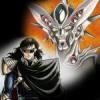
October 11, 201015 yr Author It didnt quite work out that way, but I just uploaded it into FB and resaved it, and low and behold it FINALLY worked. Ok here we go, this is the picture I drew almost two years ago, roughly around 5/14/09. It is two main characters and the males animal symbol behind him. Wu Fang (the black dragon) and Yukila (the butterfly) from my story Eclipse. You may remember it briefly from one of my discuessions before, but anyways here it is. Note: This was the rough draft of the image of the characters, they don't necessarily look like that. Edited October 13, 201015 yr by Mirabilis
October 13, 201015 yr Author Of course, my drawings arnt all that great. I think I'm a better sketcher than a drawer personally. I can sketch things pretty good, I believe, because I see what I am drawing, but when I am thinking of what I want to draw, its hard for me to do it. I don't know if that makes sense or not, but I will try to get other photos up here shortly this week.
October 13, 201015 yr I understand how you feel, I'm better at the planning drawings and sketching than doing detail. Its the main reason I decided to pursue storyboard artist over character animator; I just lack the skill to do detail work. I vaguely recall the Eclipse Story, and the characters look cool. That dragon face is badass, it reminds me of a Red Eyes Black Dragon from Yugioh
October 14, 201015 yr Author One thing that I do when i draw is use pen over pencil. I do this because it helps me to concentrate, knowing I can't erase the mistake. So if I do make a mistake, I have to start over again. At least thats how I feel about it. Edited October 14, 201015 yr by Mirabilis
October 14, 201015 yr Yeah pen and ink is always my preferred medium when it comes to drawing. I just like flat opaque color and thats easy to achieve with ink. I am currently trying to improve my digital art skills though since animation is pretty much all digital now. So gonna do anything special in Nebraska, aside from learning everything about corn?
October 16, 201015 yr Author Well, I am quite astonished. You see I finally got in touch with a manga artist today, and we exchanged words. She has shown an interest in my stories, and will give me a sketch of one of my characters sometime next week. I am quite excitied, however, I don't know where this will lead to. But I hope it works out. Oh, and uh, BK. Whats with all the corny jokes? I mean i know I moved to Nebraska but shesh!
November 15, 201015 yr Author Well I contacted her via by internet. Things are going pretty smoothly. So far we've been discuessing about it, and she asked me to send her sme rough sketches for a basic idea of what to draw. On another note, I finshed my artwork for Li Yentsui. I personally think it would have been cooler if he looked something like this, instead of the green color scheme. I didn't really like it, anyways, tell me what you think. [emote=cat]biggrin[/emote]
November 15, 201015 yr Looks great dude, did you do it on the computer or on paper then scanned? The only thing I'd recommend giving a try, is adding some extra tones especially to the purple areas. Some highlights and shadow-play would make that chest area pop out a bit
November 15, 201015 yr personally, i don't think it fits takaya's universe. when he goes for this sort of soft armour, he would fit it with an appropriate soft tone or colour, usually light and not terribly saturated. for a guyver design, I feel your contrast is too stark and jarring. but good work nonetheless.
November 17, 201015 yr Author Aw, thanks guys. This was very complicated and difficult for me. It was done in my micro-soft paint, so I was limited on my tools. I personally thought that it was much too dark, but I had to make due with what I had. This was actually my second attempt at altering Li Yentsui, I didn't care for my first attempt too much. I mainly wanted to change his body color to a darker one. Hmm...maybe I'll do a 3rd version with a blue color instead...anyways, here's my first attempt. I didn't really change much, other then the red crystal substance, and the blue gavity spheres (which I like on this attempt better). But overall I abonded it, and started over with the second version. Like I said, this was rather difficult for me, but I hope with pratice I'll get better.
November 17, 201015 yr The green feels better in this one and the brown-red creates a nice contrast drawing attention to them. However I don't like the blue, its applicated to sparingly that it doesn't feel like it fits. I'd recommend looking into Downloading a trial version of Photoshop and practice with that. MS paint is great for doodles, but if you're trying to make serious art then you're going to be wasting your time and skills. I'd offer you my Adobe Master Collection to borrow, but you don't live here In only a few short months I've gotten fairly good at photoshop and Ryuki's pretty much a master. If you need any PS help, be sure to ask him, he helped me so much.
November 17, 201015 yr thanks for saying so BK. if you want a more advanced program and want it for free, Gimp is a free software that I believe is (almost?) as advanced as photoshop. of course there are ways to get full copy of photoshop without paying but you know the score with things like that!
November 17, 201015 yr Aww no problem dude Mirabilis, if you go to a college with any kind of video game kids then I'm sure they can help you out and get you P, probably even CS5
November 20, 201015 yr Author Thanks guys, once I enlist I should be able to afford my own Photo Shop, and Illustrator, and Premiur, and every other Adobe piece. I feel you on the blue though BK, that was one of the reasons why I abonded that attempt. It didnt seem to compliment the other colors, and actually conflicted with them instead. Once I get my PS, I most likely will be seeking Ryuki out for pointers (seeing as how I am no longer able to speak with my DDT professor), so I look forward to that in the future ryuki. But for now, I'll have to use my paints. And to upload my Guyver II. I didn't change anything from this ADV 2005 series of Guyver II, which character creator and designer is Yoshiki Takaya, other than the obvious. I didn't like the red on Gold, and missed the Green Yellow color scheme. This green might be too vibrant, but I'd like to see what you guys think. [emote=monkey]think[/emote]
November 20, 201015 yr Without proper shadow play, it seems too vibrant. This is your problem with flat tones, you can't get any depth or anything. Everything just feels too bright and the images flattens out. Once you get your own PS, start playing with brushes' opacity while painting. Its an easy technique pros and digital artists use to create perfect shadow fall-off. Good looking fall-off is the key to any shadows and highlights. If things end too harshly, then your shadow-play looses all sense of realism and that will destroy your image. This has been your art lesson for today.
November 21, 201015 yr also think about colour balance. i think the anime was pretty poor with colour balance actually so i messed around with that screenshot a bit. I'm wondering where you got the green from? i never saw guyver 2 have green on him. as far as i remember.
Join the conversation
You can post now and register later. If you have an account, sign in now to post with your account.